Panel Title
text
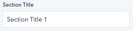
Add accordion panel section title. This is the caption visible regardless of if the accordion is expanded/contracted.
Panel Content
text
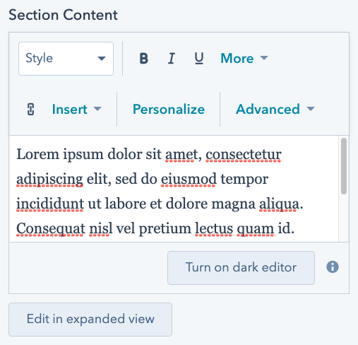
The body text of the accordion panel section, only visible when the accordion section is expanded.
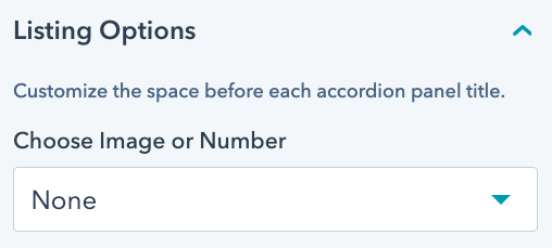
Panel Options
choice
Customize the way accordion sections are listed. Available options include:
- None
- Image
- Number
- Font Awesome Icon
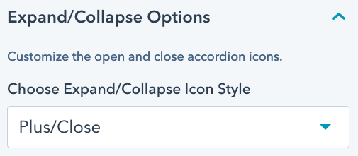
Expand/Collapse Options
choice
Customize the icons used to expand/contract each accordion section. Includes the following font awesome icon pairings:
- Plus/Close
- Caret Up/Caret Down
- Angle Up/Angle Down
- Chevron Up/Chevron Down
- Chevron Circle Up/Chevron Circle Down
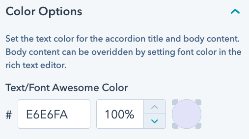
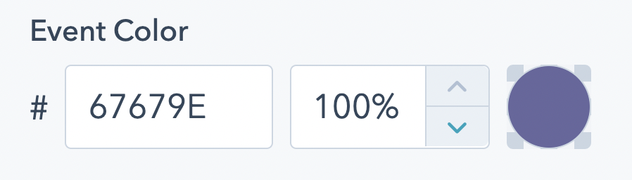
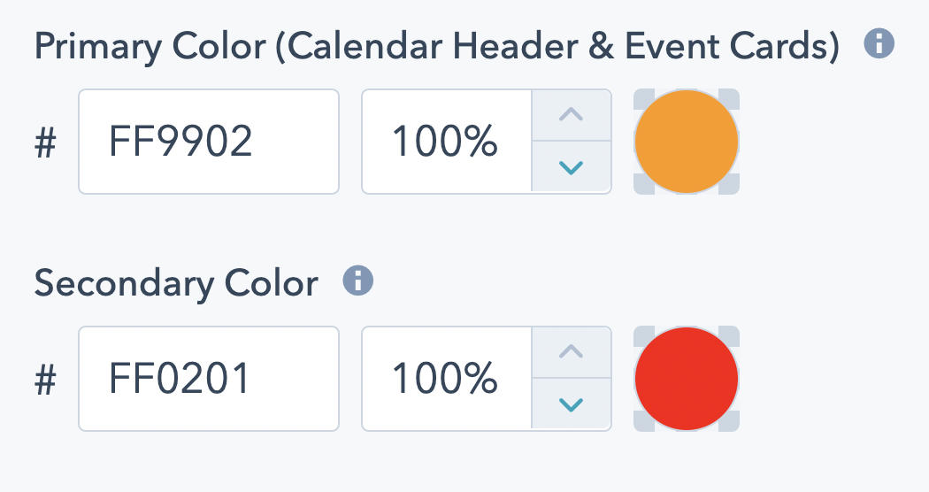
Color Options
color
Set the text color for the accordion title and body content. Body content can be overidden by setting font color in the rich text editor.
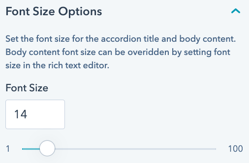
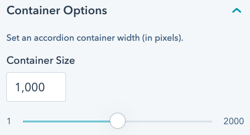
Font Size Options
number
Set the font size for the accordion title and body content. Body content font size can be overidden by setting font size in the rich text editor.
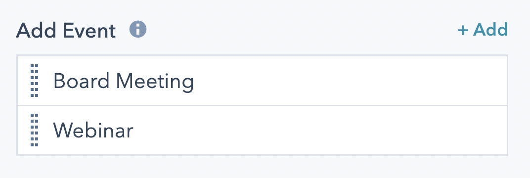
Add Event (Repeater Field)
choice
Add events to the calendar.
Manually re-order event listings, especially if chronological ordering of events is desired. Events whose dates have passed will automatically be removed from the card listing, but will remain on the calendar.
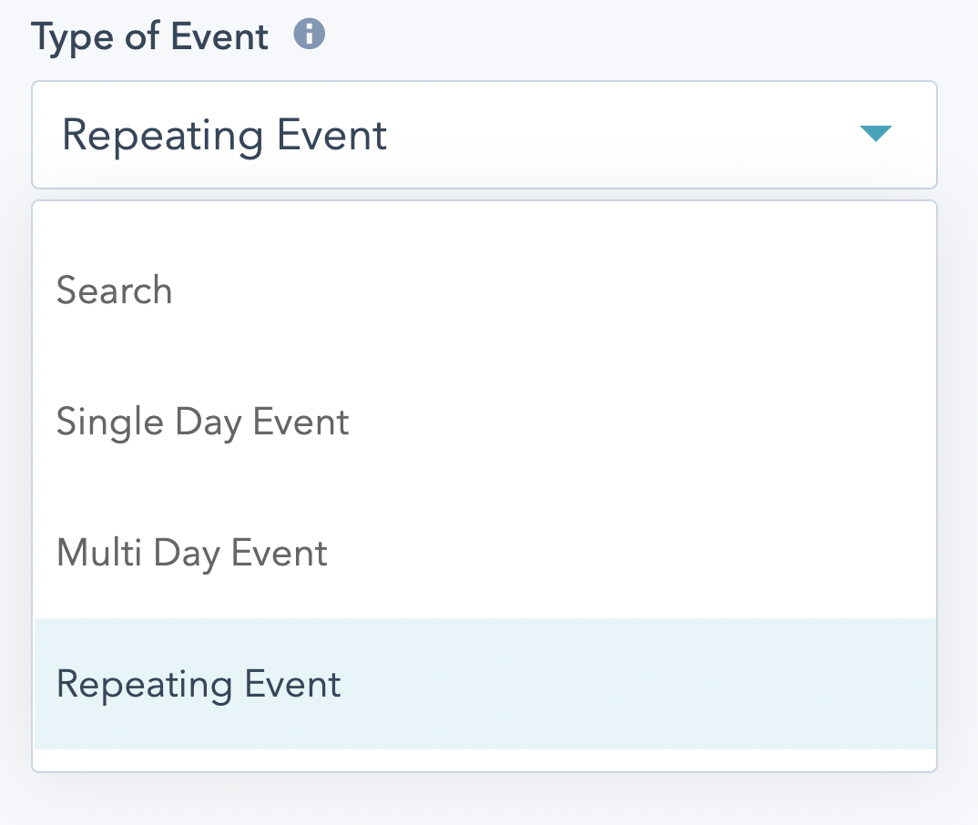
Type of Event
choice
Choose a type of event from the below options.
Single Day Events are those that occur only once on a specific day.
Multi Day Events occur during a series of consecutive days.
Repeating Events occur on a weekly, biweekly, monthly, bimonthly, or yearly basis.
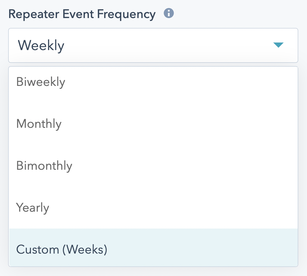
Event Frequency (for Repeating Events)
choice
Determine your event's frequency. Biweekly events occur every two weeks, bimonthly events occur every two months.
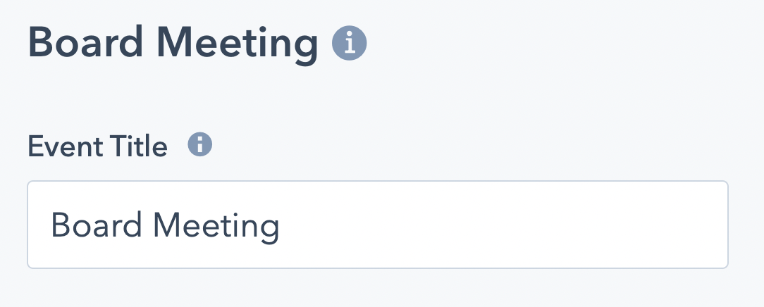
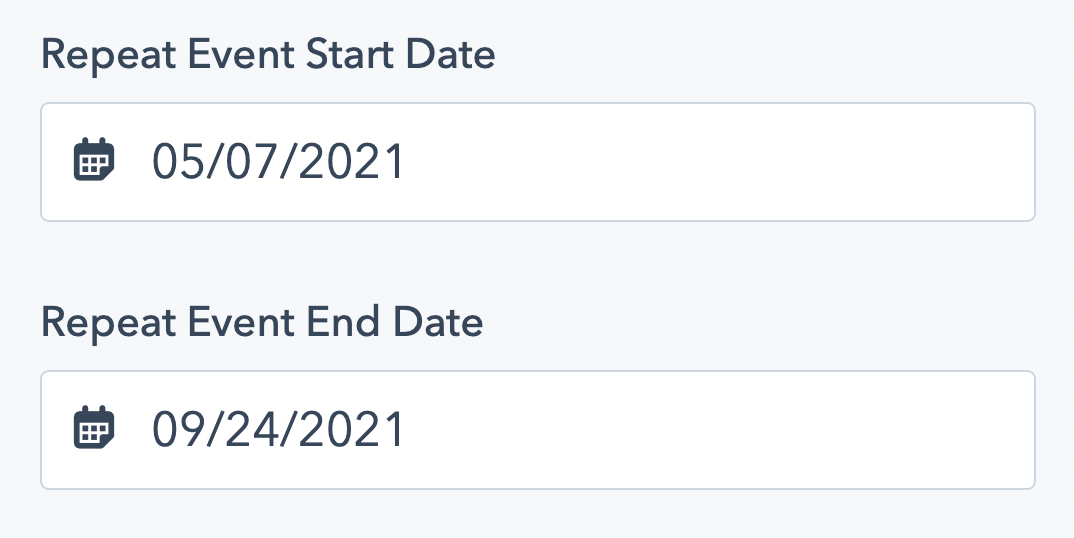
Event Start and End Date
date
For single day events, there will only be an Event Start Date.
For multi-day and repeating events, set an event start date and end date.
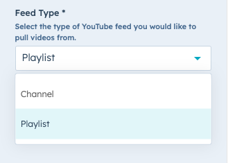
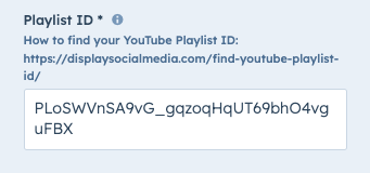
Channel ID / Playlist ID
text
Set the ID of the YouTube Channel or Playlist you wish to pull videos from.
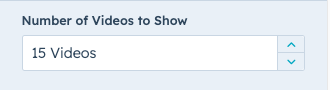
Number of Videos to Show
number
Set the number of YouTube videos you wish to show. Note: you may show up to 15 videos per module instance.
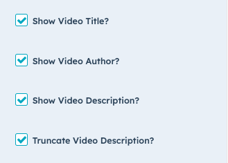
Additional Video Settings
boolean
Determine which video display options to show (or hide), including:
Video Title
Video Author
Video Description
Truncate Video Description
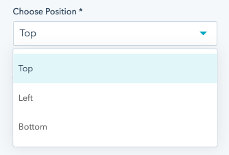
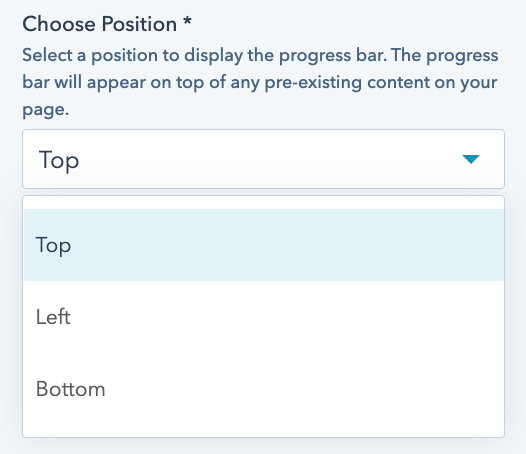
Choose Position
choice
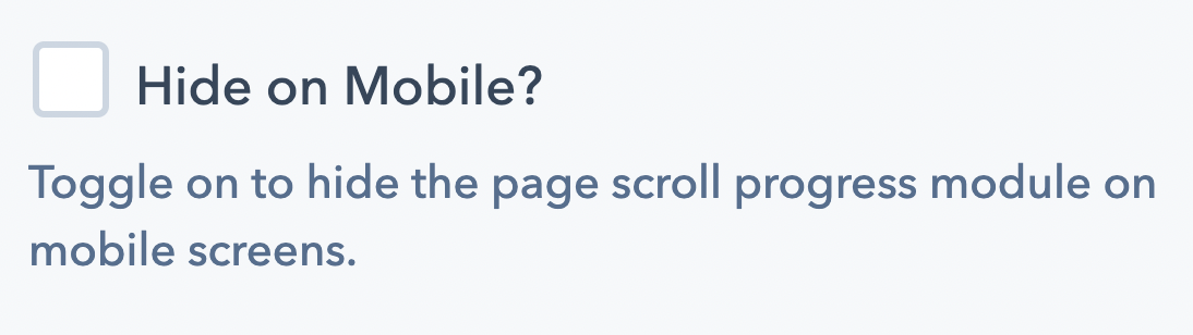
Choose a position where the page scroll progress module will be placed. Options include top, bottom, and left.
Note: The "right" position is not an option in order to prevent any negative impact to the user experience with the default page scroll bar.
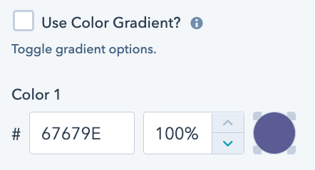
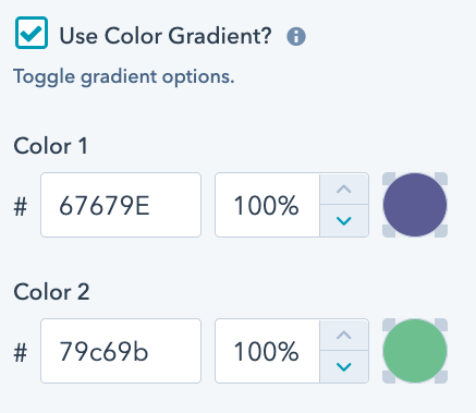
Set Color Options
color
Set a single color or choose a 2-color gradient for your page scroll progress bar.
Toggle the "Use Color Gradient" option "on" to enable to 2 color pickers. Toggle the "Use Color Gradient" option to "off" to enable 1 color picker.
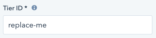
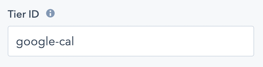
Tier ID
text
Set a unique name for this module. The ID should be one word; if two words are necessary, separate the words with a dash '-'.
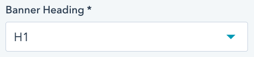
Banner Heading
choice
Select the heading size you wish to apply to the auto-type module. Choose from H1, H2, H3, H4, H5, H6, and p.
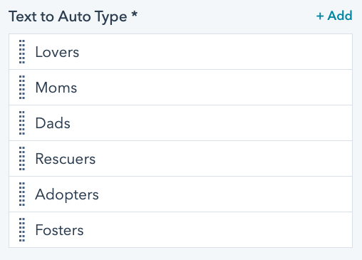
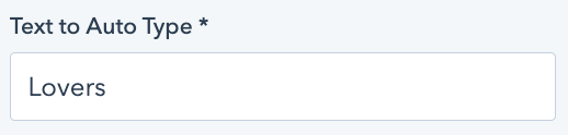
Text to Auto Type
text
Set the text string(s) that should be auto typed.
Note: This module field supports repeated options. You can set as many text strings for the module to type out, in the order in which you set the text strings.
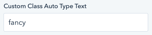
Custom Class Auto Type Text
text
Add a custom class, to be applied specifically to the auto type text string(s).
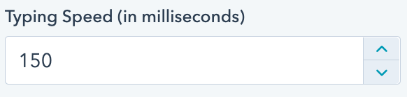
Typing Speed
number
Set the speed at which the module auto types the text.
Note: this value is in milliseconds
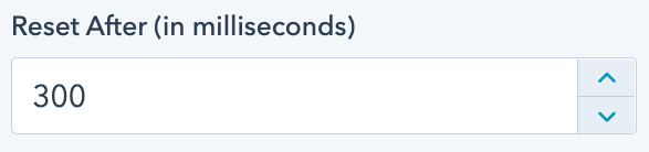
Reset After
number
Set the amount of delay or pause in between the end of one auto type text string and the beginning of the next.
Note: this value is in milliseconds
Tier ID
text
This value should be a unique for each instance of this module on a landing page, blog page, or website page.
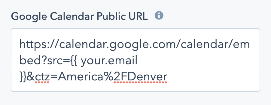
Google Calendar Public URL
text
The public URL of your Google Calendar.
See tutorial video in module documentation on how to find your Google Calendar public URL.
Choose Position
choice
Choose a position where the page scroll progress module will be placed. Options include top, bottom, and left.
Note: The "right" position is not an option in order to prevent any negative impact to the user experience with the default page scroll bar.
Choose Position
choice
Choose a position where the page scroll progress module will be placed. Options include top, bottom, and left.
Note: The "right" position is not an option in order to prevent any negative impact to the user experience with the default page scroll bar.
Choose Position
choice
Choose a position where the page scroll progress module will be placed. Options include top, bottom, and left.
Note: The "right" position is not an option in order to prevent any negative impact to the user experience with the default page scroll bar.
Choose Position
choice
Choose a position where the page scroll progress module will be placed. Options include top, bottom, and left.
Note: The "right" position is not an option in order to prevent any negative impact to the user experience with the default page scroll bar.
Choose Position
choice
Choose a position where the page scroll progress module will be placed. Options include top, bottom, and left.
Note: The "right" position is not an option in order to prevent any negative impact to the user experience with the default page scroll bar.
Social Share Module
A customizable progress bar that tracks with page scroll on your website.
textSet a unique name for this module. The ID should be one word; if two words are necessary, separate the words with a dash '-'.
choiceSelect the heading size you wish to apply to the auto-type module. Choose from H1, H2, H3, H4, H5, H6, and p.
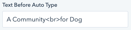
textSet the text that should appear before the auto typed text string.
textSet the text string(s) that should be auto typed.
Note: This module field supports repeated options. You can set as many text strings for the module to type out, in the order in which you set the text strings.
textAdd a custom class, to be applied specifically to the auto type text string(s).
textApply text above the entire module/tier, if desired.
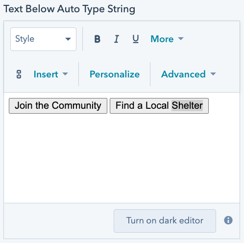
textApply text below the entire module/tier, if desired.
booleanCheck this box to set all text in the module to white.
booleanCheck this box to infinitely loop through the auto type text string(s).
numberSet the speed at which the module auto types the text.
Note: this value is in milliseconds
numberSet the amount of delay or pause in between the end of one auto type text string and the beginning of the next.
Note: this value is in milliseconds
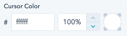
colorSet the color of the "fake" cursor.
Note: The default is white, so the cursor may seem invisible if applied to a light/white background.
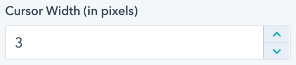
numberSet the width or thickness of the "fake" cursor.
Note: This value is in pixels (px).